The Mobile Design Elements That You Have to A/B Test

By Techelix editorial team
A global group of technologists, strategists, and creatives bringing the latest insights in AI, technology, healthcare, fintech, and more to shape the future of industries.
For years, designing mobile apps has meant balancing instinct with research. Designers debate button colors, icon styles, and text readability — but without real data, it’s often a guessing game. That’s where A/B testing steps in.
Instead of relying on gut feel, you can put two versions of your design in front of users and see which one drives more engagement, faster task completion, or higher satisfaction. It’s not about testing everything — it’s about focusing on the elements that have the biggest impact on how people use your app.
Here are the design elements every mobile product team should prioritize when running A/B tests.
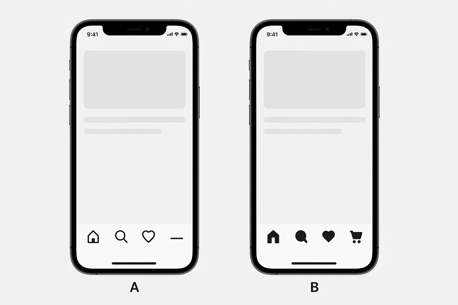
A/B Test Iconography
Icons are the language of your app. They’re often the first thing users notice, and if they don’t make sense, confusion sets in quickly. New users especially rely on icons to guide them before they’ve learned the layout.
Testing different icon styles helps uncover whether users understand what each symbol means without hesitation. If people tap an icon and immediately backtrack, it’s a clear sign the design isn’t intuitive enough.
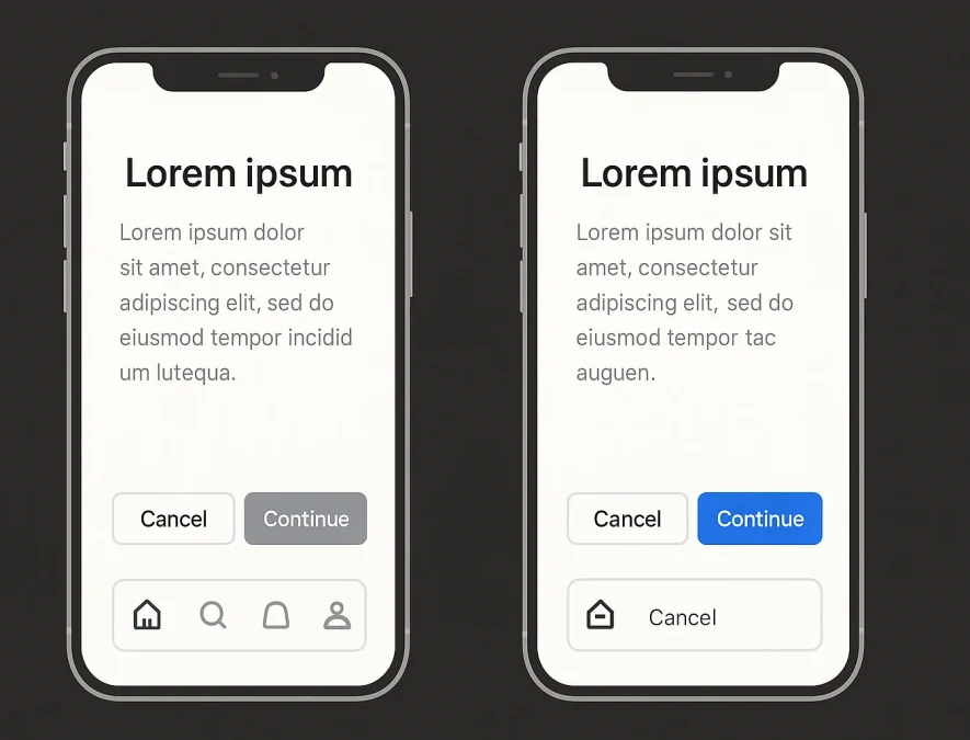
A/B Test Button Placement & Color
Buttons are where decisions happen. Whether it’s a sign-up, purchase, or confirmation, their placement and color strongly influence behavior.
Research shows users often act based on visual hierarchy more than text. A bright, well-placed “continue” button gets tapped more often than a muted one hidden in a corner. The same applies when balancing multiple actions — symmetry can signal equal importance, while contrast points to the primary choice.
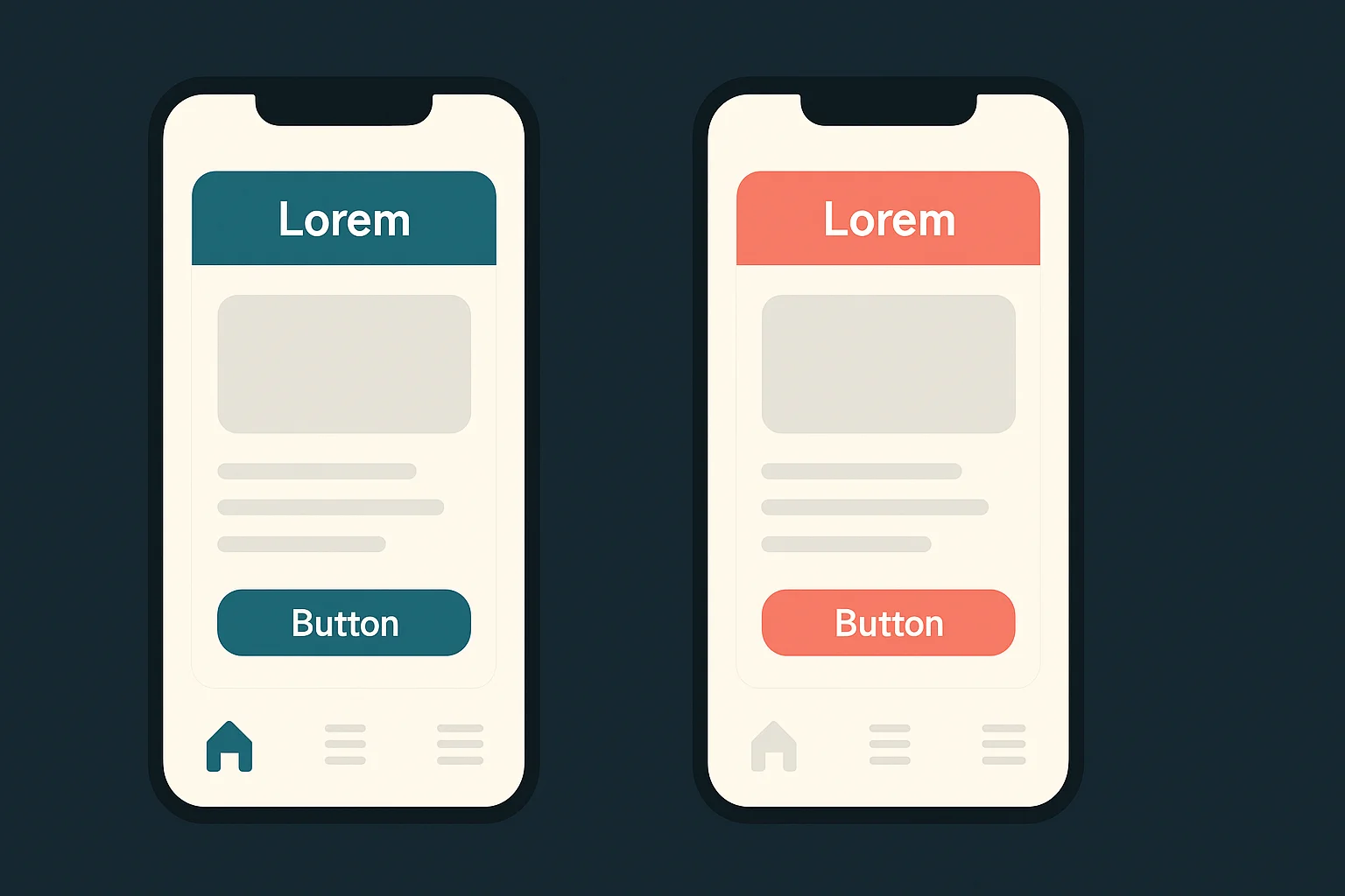
A/B Test Color Schemes
Color doesn’t just set the mood — it directs attention. Brand guidelines may push for consistency, but too much uniformity makes it harder for users to find what matters most.
Through A/B testing, you can discover whether subtle shade adjustments or bold palette changes improve navigation and task completion. Even results that show “no difference” are valuable, because they keep you from redesigning in circles.
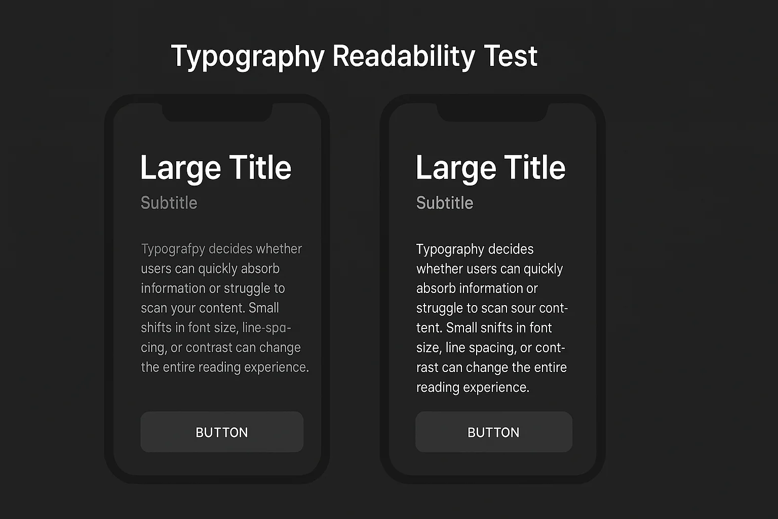
A/B Test Typography & Readabiblity
Typography decides whether users can quickly absorb information or struggle to scan your content. Small shifts in font size, line spacing, or contrast can change the entire reading experience.
Testing different text styles helps you strike a balance between aesthetics and legibility. Sometimes a slight size increase boosts readability without breaking the layout, while other times softer contrasts create a smoother visual experience.
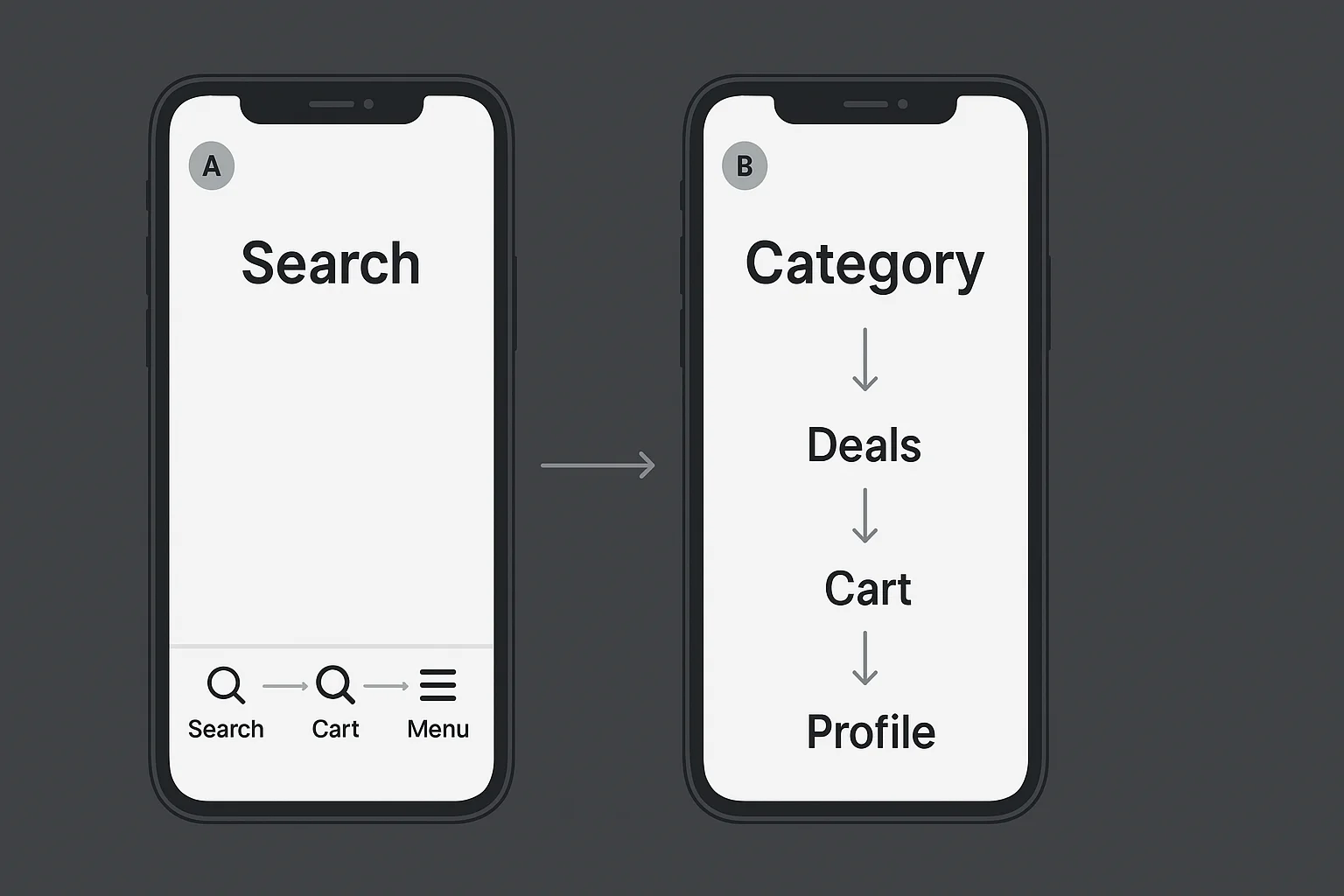
A/B Test Navigation Flows
Navigation is the backbone of user experience. If people need too many taps to find something, or can’t predict where a menu item leads, frustration grows.
A/B testing flows means experimenting with different menu structures or screen hierarchies. Maybe “search” belongs in the bottom bar instead of the top menu. Maybe “cart” is more effective as a floating button. Testing reveals which path gets users to their goals faster.
Iteration in UX Design
The real power of A/B testing is iteration. You start with a hypothesis, test it, learn from the results, and refine. Different audiences may prefer different designs — what works in a gaming app may fail in a banking app.
Good UX isn’t about guessing right the first time. It’s about using data to make design decisions that feel natural to users. By testing icons, buttons, colors, typography, and navigation flows, you’ll continuously move closer to an app experience that feels effortless.
As UX pioneer Jared Spool once said, “Good design, when it’s done well, becomes invisible.” A/B testing is how you get there. And if you’re looking to bring this same level of clarity and iteration into your product, our UI/UX Design services can help you craft interfaces that not only look good but perform even better.
Build custom AI solutions that deliver real business value
From strategy to deployment, we help you design, develop, and scale AI-powered software that solves complex problems and drives measurable outcomes.