 Icons, when designed well, come with real advantages:
Touch-friendly → Icons are usually large enough to hit easily on touch screens.
Space-saving → They help designers fit more features into small screens.
Fast recognition → Familiar icons like “home” or “search” are recognized instantly.
No translation needed → An envelope means “mail” almost everywhere in the world.
Visual appeal → Icons break up text-heavy screens and add polish to a product.
Established pattern → Users already expect to see them — nearly every app uses icons.
But here’s the thing: those strengths turn into weaknesses when icons are vague, inconsistent, or overloaded with meaning.
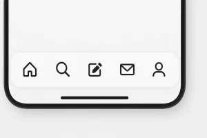
 Some icons achieve near-universal recognition. Think of the home icon 🏠, the shopping cart 🛒, or the print icon 🖨️. These symbols are so widely used that most users don’t need to guess their function.
But don’t get too comfortable — truly universal icons are rare. Outside of a handful of examples, most pictograms still create confusion because meanings shift across platforms.
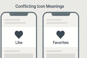 Things get tricky when icons look familiar but mean different things depending on the app. A great example: the heart ❤️ and the star ⭐.
In some apps, a heart means “like.”
In others, it means “save to favorites.”
A star might mean “bookmark” in one app and “feature” in another.
This inconsistency frustrates users and forces them to guess. As Nielsen Norman Group points out, icons with multiple interpretations often lead to mistakes and hesitation.
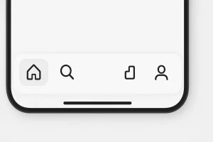
 Sometimes apps need icons for brand-new features, like tracking your sleep time or reviewing past orders. Designers often invent unique icons for these — but here’s the problem: unique often means unrecognizable.
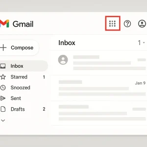
A well-known case: when Google hid its app grid behind an abstract icon in Gmail, users flooded support with questions like “Where’s my Calendar?”
The lesson? Just because a designer understands an icon doesn’t mean the user will — especially first-timers